EMAR
Client
EMAR
Year
2020-2022
Scope of Work
Human-Robot Interaction
Location
Seattle
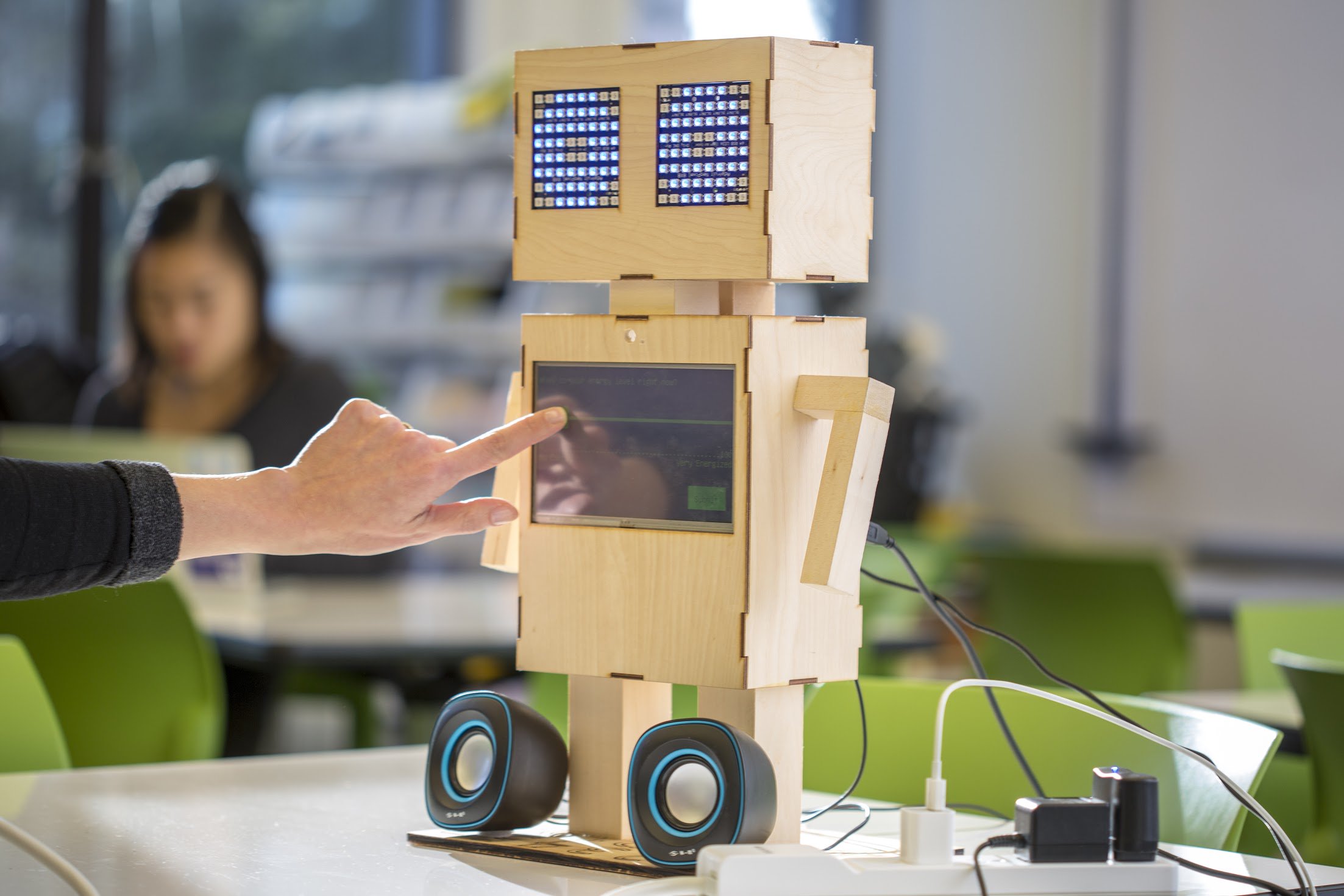
Project EMAR(Ecological Momentary Assessment Robot) is about the design and development of a social robot to measure and improve adolescent mental health. I worked as a research intern sponsored by CoMotion Mary Gates Innovation Scholars program and Human-Centered Design & Engineering department at University of Washington.
.png)
Problem
While reviewing discussions in the Overwatch community on Reddit, I identified navigation as a recurring pain point for players. Many users found difficulty browsing and understanding their match history due to information being fragmented across multiple tabs. Then I conducted a guerrilla usability study with 5 Overwatch players and analyzed media coverage, critic reviews, and community feedback to uncover the following issues:
• Players must repeatedly switch tabs to access related information
• Users must remember where specific information is located
• Context is lost each time the view changes
User Flow Analysis
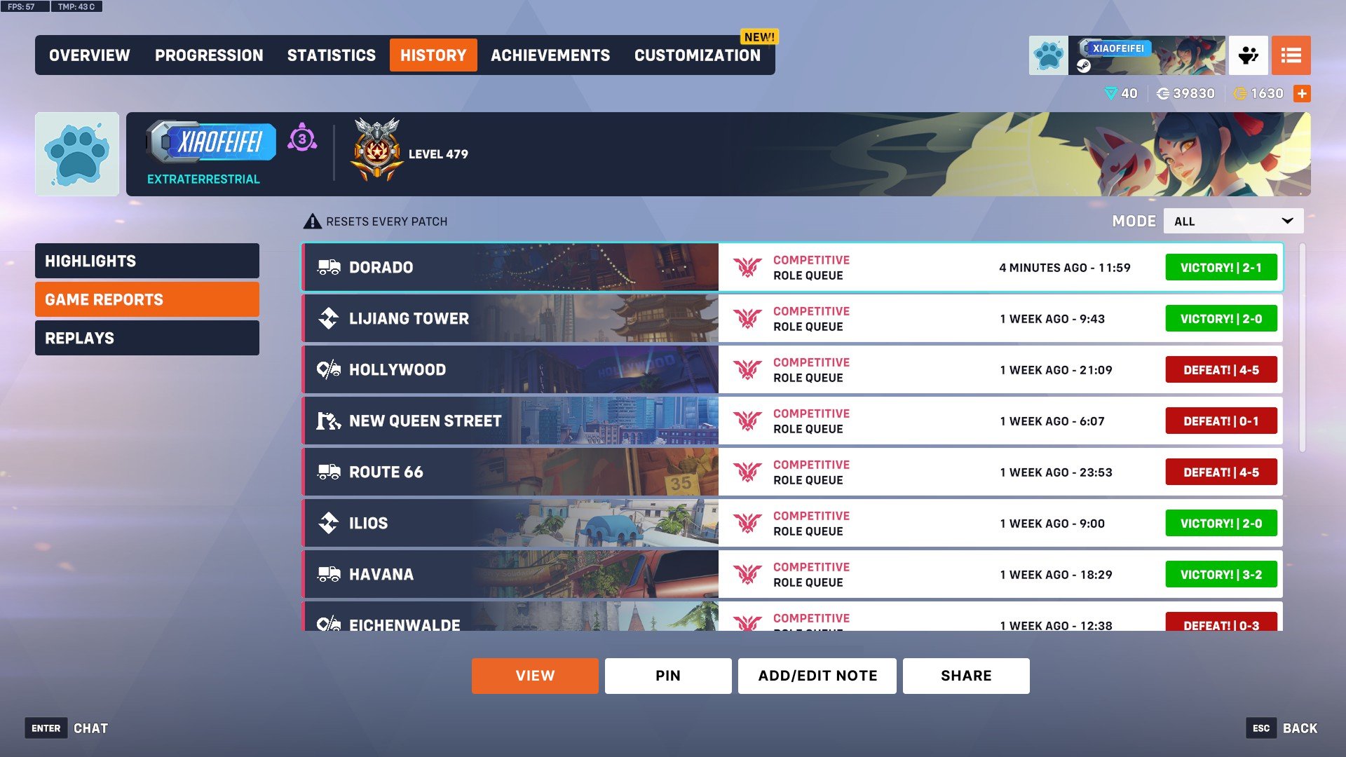
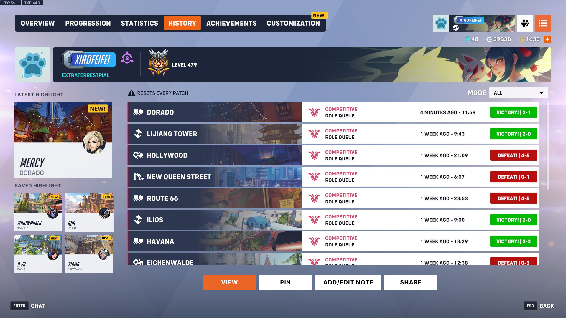
Below shows the current design of how to get to the History page and the amount of sections divided in it. I mapped the 7 steps required from main screen to reach the Scoreboard which is a core feature and critical source of information for players in FPS games. and I could see why players were frustrated.
Additionally, accessing the Scoreboard is hindered because the History section is split across multiple tabs, like Highlights and Replays, which increases context-switching costs by repeatedly pulling users away.
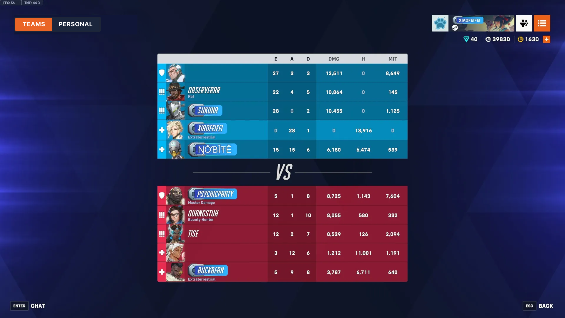
Even when users select the Game Report tab to access the Scoreboard, they are first presented with a redundant summary screen that repeats basic information such as KDA—data already available in the Scoreboard itself—forcing an additional click before reaching the most relevant content.
.png)
Goal
The goal was to reduce navigation friction and cognitive load by consolidating fragmented match-related information—such as highlights, game reports, and replays—into a single unified view, making History a true “one-stop shop” for past match data. Additionally, unnecessary navigation and tab switching are minimized by removing redundant information from the game report page.
History Page Prototype
Current Prototype
The current design of History page separates highlights, game reports, and replays into different tabs, forcing users to context switch and remember where information lives instead of recognizing it at a glance. Moreover, excessive navigation depth and tab switching reduce efficiency, making it frustrating for users to quickly review past matches.
My Prototype
The redesign consolidates all relevant match data into a single view, enabling faster information retrieval and improving overall flow and usability. User no longer need to click through different tabs to access different pieces of information. As a result, History is transformed from a navigation-heavy hub into a focused and streamlined match review experience.
Game Report Prototype
Current Prototype
Repetitive information is surfaced across multiple sections of the Game Report page. For example, hero play percentage appears in both the Summary and Personal tabs, KDA shown in the Summary tab is also available on the Scoreboard, and the “View Replay” action is duplicated despite already existing at a high navigation level based on the current design. This redundancy adds visual noise, increases cognitive load, and reduces clarity by presenting the same information and actions in multiple places.
.png)
My Prototype
I consolidated the three separate tabs into two without removing any information and set the Scoreboard as the default view when users open the game report, since it receives the highest usage. Previously, accessing the Scoreboard required an extra click because it was not the default screen; making it the landing view reduces interaction cost and improves efficiency. Additionally, the Personal tab now provides access to hero-specific performance data as well as the game replay, keeping personalized insights and related actions in one place.
.png)
Final Work
Reflection
Empowering players to access the information they need means designing guidance that supports their decisions. Before reviewing past matches or analyzing team performance, it’s important to provide a clear, unified view that minimizes friction. Context is the key to helping players understand their performance, make informed choices, and focus on what matters most—improving their gameplay and enjoying the experience.
I’ve loved immersing in Overwatch’s fast-paced team battles and the rich strategies that make every match unique. Redesigning the navigation started as a curiosity project, but quickly became a valuable UX exercise. Most importantly, it connected me with the player community—passionate gamers who shared their frustrations and insights, and I can explore more UX opportunities to help them.
Problem
During COVID, students are reported to experience a higher stress level, which could lead to serious consequences, including depression and anxiety, mental and memory problems, and digestive and sleeping issues. In response, we aimed to explore ways to more accurately measure stress and design solutions that help students manage and reduce it.
Affective Computing
Affective computing is the study and development of systems and devices that can recognize, interpret, process, and simulate human affects including emotions, mood, attitudes, and feeling. We identified it being the most efficient and convenient way to intervene stress level when collecting users data and responding to human affects.
User Research Insights
After conducting interviews with 12 students from our school, we identified that our design with affective computing should
1. sense users’ emotions throughout the day as continuous emotional input allows the system to detect stress patterns and provide timely support.
2. determine their attitudes and overall mental state, because understanding a user’s baseline helps identify between typical fluctuations and moments that might require intervention.
3. understand the challenges they are experiencing, since identifying the causes of stress enables our system to generate more relevant and personalized guidance.
4. capture changes and shifts in their mood over time, which is essential for recognizing long-term trends and evaluating whether the user’s well-being is improving or declining.
Proposed Solution
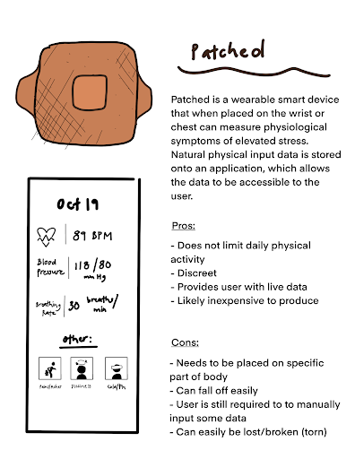
Our proposed design integrates a wearable patch with a mobile app to monitor users’ vitals, estimate stress levels, and recommend activities to help alleviate stress.
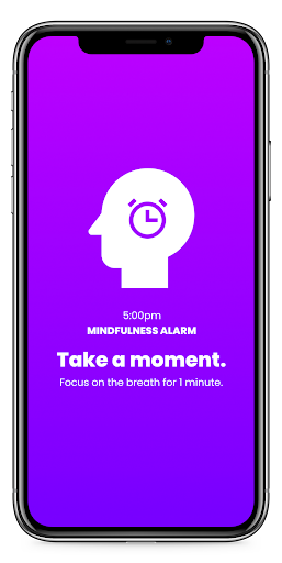
The Patch is a lightweight wearable containing a smart sensory chip that measures key physiological indicators and visualizes both current readings and potential symptoms. Complementing this, the Mindfulness Alarm app provides responsive notifications that prompt users to check in with their mental state and offers tailored suggestions to support emotional well-being.
Why we pick this over other solutions
We initially ideated a few solutions, including a facial-recognition system that analyzes users’ emotions using expression tracking and machine-learning models, an emotionally aware chat-bot that converses with users to assess their mental health, and smart glasses that monitor physical conditions while remaining portable.
We converged on the wearable patch concept because it best aligns with our design goals: it is forgettable, allowing the system to continuously collect physiological data needed for accurate stress detection; it is convenient, enabling users to carry the technology effortlessly throughout the day; it is also inconspicuous, minimizing social or psychological discomfort by blending seamlessly into everyday wear.
Lo-Fi Mockup
.png)
Our system is organized into several key pages that support stress tracking and relief. The Home page allows users to view their overall health trends and set up personalized mindfulness alarms. The Activity page offers stress-relieving options such as mindfulness exercises, reading, and music. The Alarm page helps users schedule breaks and engage in calming activities during the day. The Quest page provides daily wellness tasks that users can complete to build healthy habits. Finally, the Health Trend page lets users track detailed patterns in specific health categories over time, helping them better understand their mental and physical well-being.
Usability Testing
Main user experience aspects we want to explore are how efficiently user can obtain and understand their bio data and how quickly they can set up an mindfulness alarm. We gave user the following tasks:
1. Set up an mindfulness alarm and follow given instructions
2. Check bio data and view data summary
3. Complete a recommended activity
Insights
Some users suggested that we support external web links in the app, and implement a recommendation system for readings and music.We also learned that some of our iconsneed to be changed to imply more about their functions. We could also revise the content layout for certain parts of the workflow, since users often tapped on icons that were not relevant to the ideal functions.
Visual Work
Hi-Fi Mockup
.png)
Affective Computing
Users can access their bio data including body temperature, respiratory rate, and heart rate through the home page. They can view the current state versus the trend of data
Users can access their bio data including body temperature, respiratory rate, and heart rate through the home page. They can view the current state versus the trend of data
Users can access their bio data including body temperature, respiratory rate, and heart rate through the home page. They can view the current state versus the trend of data
Interactive Demo
Overview
Project EMAR is currently funded by the National Science Foundation(NSF) as part of the National Robotics Initiative. EMA stands for Ecological Momentary Assessment, a method that captures subject’s current behaviors and experiences in real time, in subjects' natural environments. This project is an interdisciplinary investigation of teen-robot interaction in an effort to effectively capture adolescent stress levels during interactions with a social robot.
Research with ELLs
We aim to understand how English Language Learners (ELLs) perceive EMAR and explore how the robot can support their learning experience in schools. Previous research shows that teens experience higher levels of stress than any other age group, and this stress can have significant negative effects on both their mental and physical well-being. Therefore, we want to examine how EMAR might help reduce stress for ELL students during their academic activities.
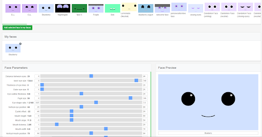
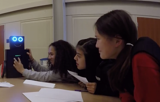
Face Design Session
Teenagers was asked to design the face and expression of the robot by adjusting parameters on the screen, and they will give a name after they finish designing.
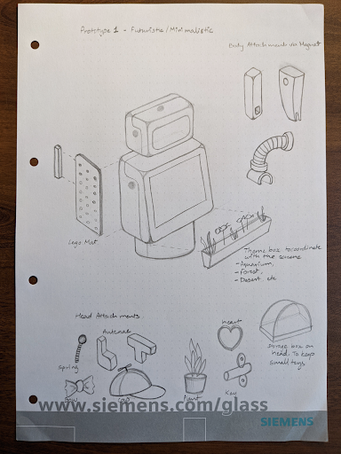
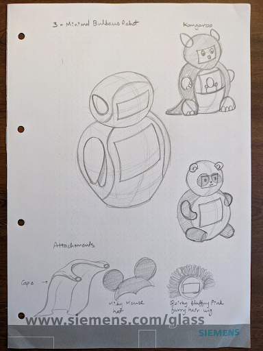
Embodiment Design Session
We prepared design kits for teens to interact with and make their favorite looks of the robot. This helps us to drive insights on the design of EMAR in the future.

Interaction Design Session
The kids talked to the robot and interact with it. EMAR will give certain responses to teens such as tilt head, rotate body or show up certain messages on its belly screen.
Example Interaction Scripts
EMAR: Hello, I am EMAR (or custom name). I am a social robot who likes to hear stories in all languages, especially Chinese.
EMAR: Can one of you tell me a story about something that happened at camp last week….? (active listening) [EMAE tilts head, moves body, blinks, while listening]
EMAR: Thank you all for sharing your stories. I love hearing stories and I need to meet with more children today, so we’ll have to say goodbye. [goodbye screen?]
Example Embodiement Design Idea

Research Findings
Teens expressed a strong preference for designing the robot’s appearance themselves rather than receiving a pre-designed version. They found the robot cute and somewhat anthropomorphic, and many began referring to it as “he” instead of “it” after giving it a name. Teens also expressed a desire for the robot to speak, noting that verbal cues such as “go on” or “I’m listening” would make sharing their stories feel more natural and supportive.
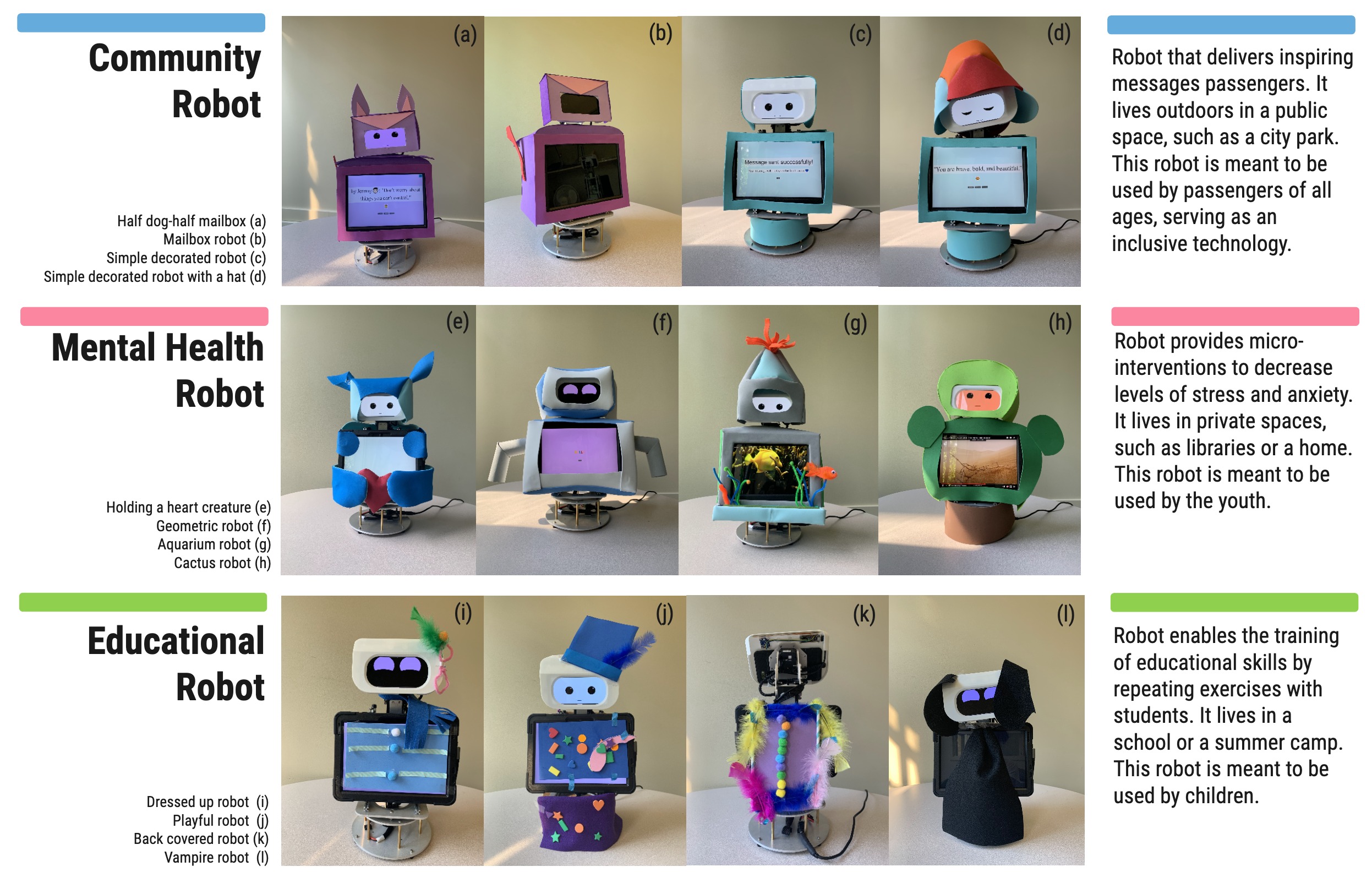
Messenger Robot
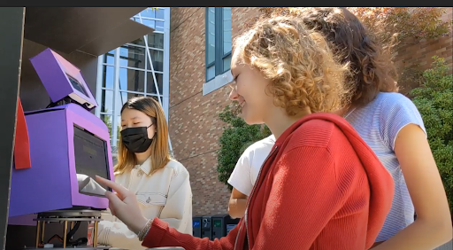
We want to design a social robot in the public setting of campus, and our audience is the general public instead of teenagers in this case. We want to explore what some aspects of designs and embodiments of our social robot might or might not work for the general public, so that we can give insights to future study and research.
We ideated a messenger robot with the function of sending and receiving message from strangers. People are able to input messages for public and others walk by later can see the message left by previous people. We want to explore if this design can help to foster a positive atmosphere in university and strengthen connection among people.
General Function
The social robot features an Ambient Mode that allows it to blend naturally into its environment and its front screen allow people to access one message left by a person. It has the function that people who pass by can choose to receive a message, create a new one, or browse through the next message, enabling simple and meaningful interactions. In addition, the robot displays stress reducing information such as encouraging prompts and calming animations to help users feel emotionally supported during moments of stress.
.png)
Example Research Question
•What do people think the robot is for and what is the purpose of the robot in their opinion?
•Do people want to have such a messenger robot in their community and where do they like to have it implement?
•What other functions would people like to see?
•Do people like the general appearance of the robot?
•How can we better improve it?
Insights
We observed that some participants were unsure whether the messages displayed on the robot were generated by the robot itself or submitted by other people, suggesting a need for clearer message attribution. One participant mentioned that adding a school mascot logo would make the robot feel more relatable and increase their sense of belonging. Additionally, several participants expressed interest in having a voice-recording option alongside text input, as they found speaking more convenient and natural than typing.
Changes We Made
In response to user feedback, we implemented several key design updates. First, we gave users the option to include their name with each message, helping clarify whether a message came from the robot or another person. We also redesigned the robot’s embodiment into a mailbox featuring a school mascot logo, which strengthens school identity and increases users’ sense of belonging. Additionally, we introduced a voice-recording feature to offer a more convenient alternative to text input. To further improve interaction clarity, the robot now performs simple confirmatory movements that signal when a message has been successfully received or recorded.
Results and Findings
We conducted another round of usability studies with a few extra questions regarding to our updates. We found that most participants prefer audio record because it’s convenient, and since we add the function of including name for this round, we noticed most participants include their names and wish to see the name of people who sent the messages. For detailed research and findings please refer to this paper.
Future Plan
In general, Project EMAR hopes to begin pilot testing of new prototypes of different use cases in a regional school districts, studying efficacy, usability, adoption, and disruption. For this specific community-based use case, we plan to conduct A/B testing on two more embodiment design idea for the messenger function.
PropView
PropView is a “one-stop-shop” for property photos, information, map view, and AI-enhanced predictions about the property or its attributes. Before I join, PropView was mainly used by Amfam underwriters. We wanted to expand the use case of PropView by creating customized experiences for the following user groups: Agents, Claims, Public, and Commercial Farm/Ranch. I focused on agents during my employment as they are important stakeholders of the company. I designed the mobile version of PropView for agents to use when they need to visit properties in person.
.png)
Problem
The RBC Interface Guideline (RIG) is RBC’s official design system. It provides reusable coded components, design patterns, global standards, and a shared tooling ecosystem that supports collaboration between designers and developers. RIG is actively maintained by a community of contributors and is documented across both Figma and the RBC.Design website.
Across the last few customer satisfaction surveys, documentation has consistently surfaced as an area needing improvement. Highlights of the problem include documentation living in different tools, with mismatching and outdated information. Additionally, Figma is not an accessible and inclusive tool for all of our users to access.
What Is a Design System
A design system is a systematic and scalable approach to product development. It provides set of components, tools, guidelines and workflows to create products consistently and efficiently. In terms of daily work, designers and developers no longer need to re-invent the wheel for simpler designs, and they can focus their energy and time on piecing the blocks together in new ways to solve problems.

Components
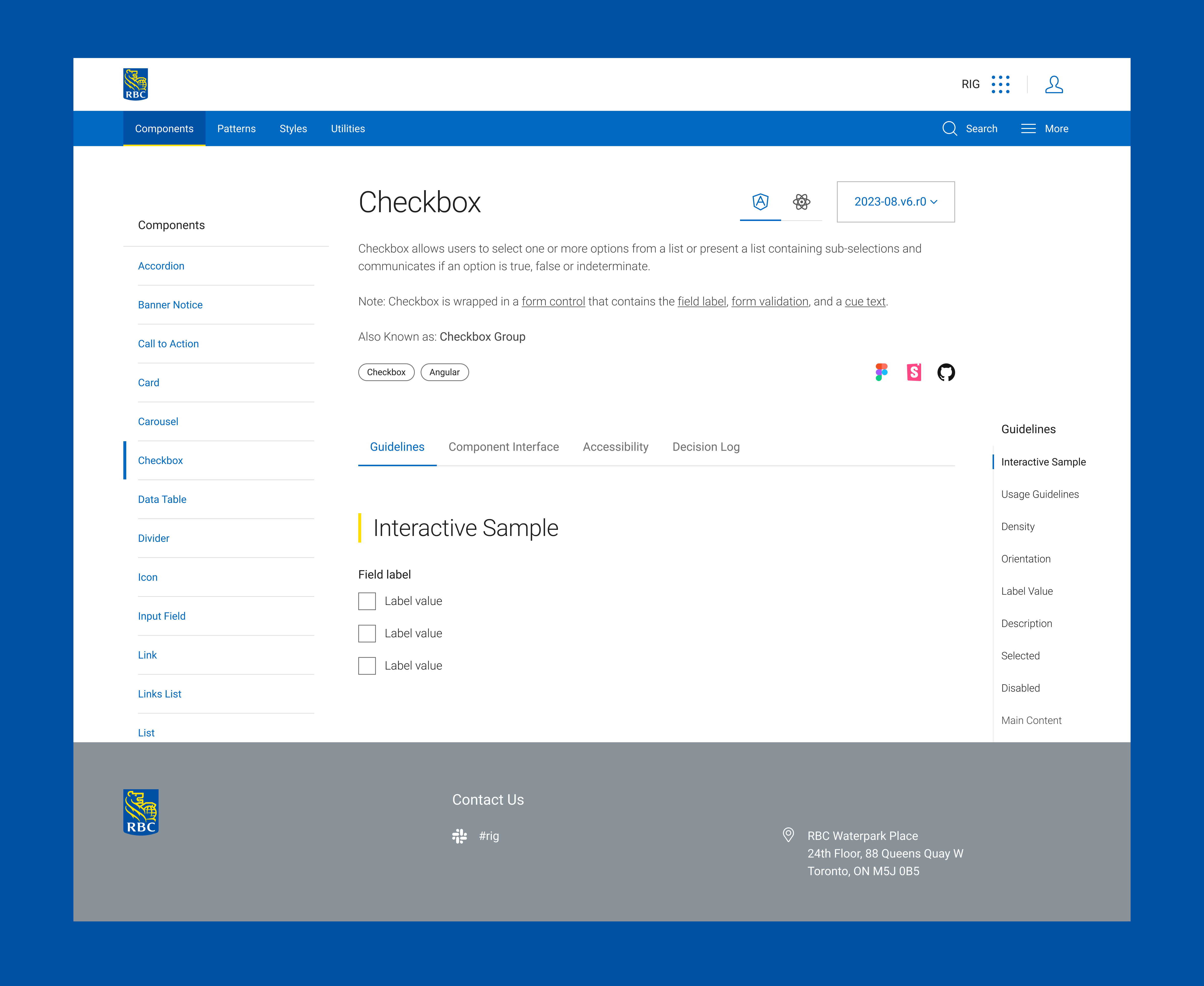
Different components have different sections documented on RBC.Design website including interactive sample, API, usage guidelines, etc. The difference between what sections each component has as well as its naming are sometimes inconsistent. Components are also being documented with different templates, and the content under some tabs are sometimes missing.
Below is an example of checkbox component and how it is documented on RBC.Design website:
.png)
Goal
My goal is to improve the documentation on our design system website so that users can trust that they will find what they’re looking for, and also helps to Increase in confidence and clarity delivered to our users. To achieve this, I need to make sure component documentation is consistent and up-to-date, and find out documentation strategies on RBC.Design website.
Approach
01
Persona
I began the process by creating personas and user flows to identify potential users of the interface guidelines. This helps me to identify potential stakeholders and gather their feedback on the current documentation.
02
Competitive Analysis
I then conducted a competitive analysis to examine the structure and strengths of modern design systems, identifying the common sections they include and determining which elements we could incorporate to improve our own.
03
Interview & Analysis
I conducted interviews with both developers and designers to gather insights on the current state of our documentation. Based on their feedback, I performed a SWOT analysis and developed recommendations for improving the documentation as well as enhancing the team’s communication with users.
04
Protoytpe
I created prototypes that incorporated these insights and carried out user-testing iterations to validate and refine the solutions.
Persona
Competitive Analysis
I researched different design systems on the market, including Microsoft Fluent, Google Material Design, Shopify Polaris, IBM Carbon, Airbnb DSL, Adobe Spectrum. Among the systems I reviewed, Spectrum and IBM Carbon stood out the most. Spectrum offers a Design Checklist that helps users easily identify missing component elements, while Carbon provides up-to-date news and articles that help users stay informed and better understand the system.
Interview
I conducted interviews with 12 participants—an equal mix of designers and developers who had significant experience using the RBC.Design website. The interviews focused on identifying which sections users found most helpful, what information they felt was missing, and what additional content could better support their workflow. I also provided a short survey that asked participants to rank different component sections based on their preferences. This helped me determine the relative importance and access frequency of each section, which later informed how I prioritized and reorganized the content.
Based on user feedback, the primary usability issues in our design system fall into three main areas:
.png)
Regarding to specific sections:
Usage Example
Users expressed a desire for more usage examples including variations that support different use cases and demonstrations of how components work within page-level layouts.
Accessibility
Visual designers expressed concern for accessibility, particularly in areas such as visual accessibility, adequate hit areas, and proper keyboard interactions.
Change Log
Developers expressed the need for a dedicated change log, as it makes it easier to track updates across versions and supports onboarding for new team members.
.png)
Proposed Solution
Based on the interview feedback, I implemented several modifications to address the identified issues:
First, I reordered the sections according to user preferences. For example, most users identified the interactive sample as the most helpful component because it provides hands-on engagement, so this section was moved to the top of the page.

I also added more rationales and real page-level examples to give users a deeper understanding of how each component works and how it should be used in context.
.png)
Regarding the page layout, I designed a new template that improves navigation by separating content into distinct sections: guidelines, component interface, accessibility, and decision log. This structure makes it easier for users to locate the information they need. I also added the floating scroller on the right side of the screen for user to go to different section on the current page.

Additionally, the updated template benefits both designers and developers by embedding direct links to the corresponding Figma, Storybook, and GitHub resources for each component.

Canary
Canary is internal and employee-facing specifically built for Underwriters. The machine learning models evaluate for specific risks that the insurance company cares about. The primary use case for these models is to help Insurance underwriters speed up and better evaluate self-inspections completed by customers who have a new or renewal insurance policy.
To provide underwriters access to Canary, I need to incorporate result of those machine learning models into Propview. I worked on designing data visualization with regard to how we make the AI predictions more understandable to the user. I also worked on how we can measure the impact of AI models on underwriting decision making when they determine insurance coverage, and incorporate into my designs.
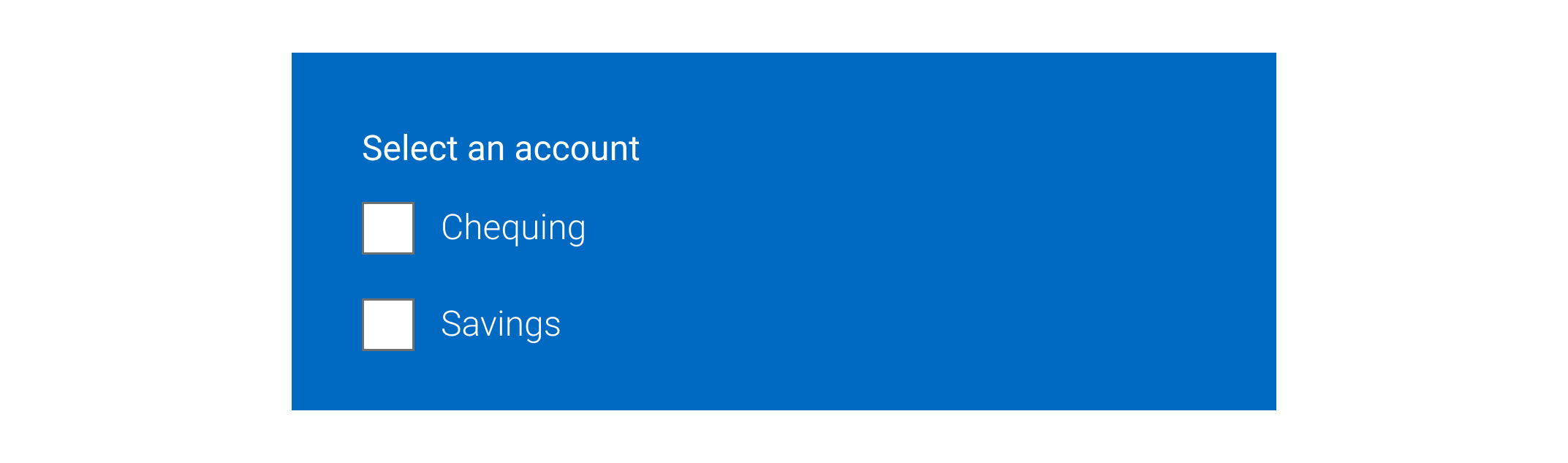
Interactive Prototype
Below is an example of the interactive prototype for one design element—the checkbox component. We have applied this same approach to all design elements across the RBC.Design website to ensure consistent usability and a cohesive user experience.
Reflection
During my internship, I had the opportunity to work closely with designers and developers to improve the usability, clarity, and structure of a large design system. Much of my work involved understanding how different users interacted with documentation, identifying gaps and pain points, and proposing solutions to create a more intuitive and consistent experience.
This experience helped me strengthen my skills in communication, collaboration, and problem-solving across cross-functional teams. I also gained a deeper appreciation for the importance of clear documentation and thoughtful information architecture in supporting both designers and developers.
My work embodied the intersection of Machine Learning products and Human-Centered design, ensuring the tools we developed served both the users and the business needs effectively. I am glad that my role as a UX designer impacted the organization's AI-driven products as my work been deployed by software engineer in the team. Moreover,my solutions to these projects created impacts on the insurance processes at American Family Insurance.
In the future, I would also like to see my team bringing more state-of-art technologies such as mixed reality and augmented reality into home inspection tools that we've worked on, creating more success for stakeholders and the company. As I recognize the iterative nature of UX design and the importance of continuous learning and adaptation, I will carry this experience into my future career and create more user-centered and data-informed solutions.
Reflection
This was my first experience working in the field of Human-Centered Design and Human-Robot Interaction, and I’m grateful that our work not only received recognition and awards but also meaningfully supported teenagers in reducing stress. Seeing the project applied successfully across different settings and scenarios was especially rewarding. Through this experience, I also realized how much potential remains to be explored—such as adapting the system for AR/VR environments or extending its mobility features to support a wider range of user groups.
.png)