.png)
AmFam
Client
AmFam
Year
2022
Scope of Work
Mobile | Website Design
Location
Seattle
I worked in the Data Science and Analytics Lab (DSAL) of American Family Insurance as a UX designer. DSAL mainly works on using machine learning and artificial intelligence to build tools for people to get information about properties. During my employment, I researched and developed AI-driven products and built both web and mobile user interface for emerging machine learning technologies.
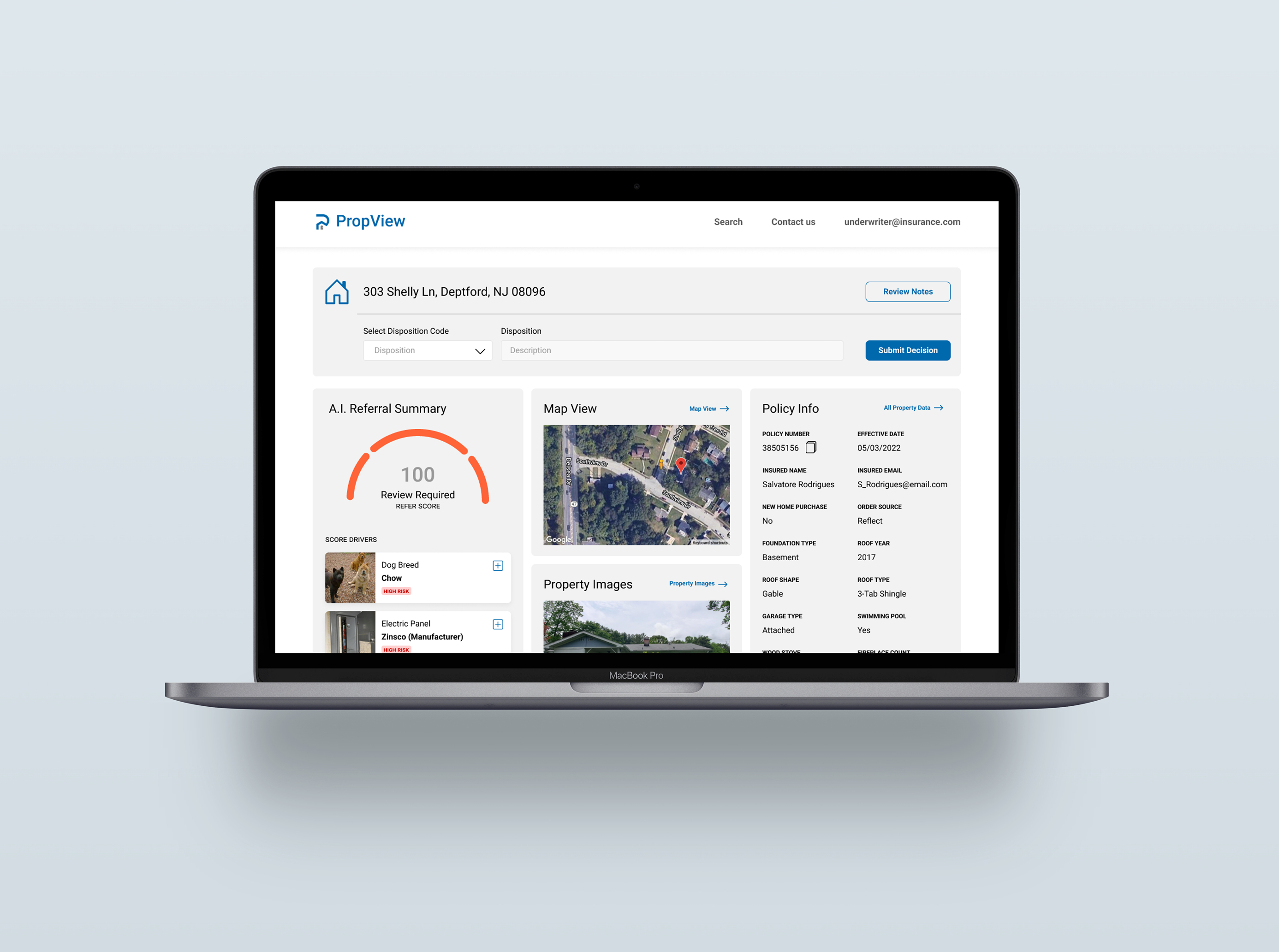
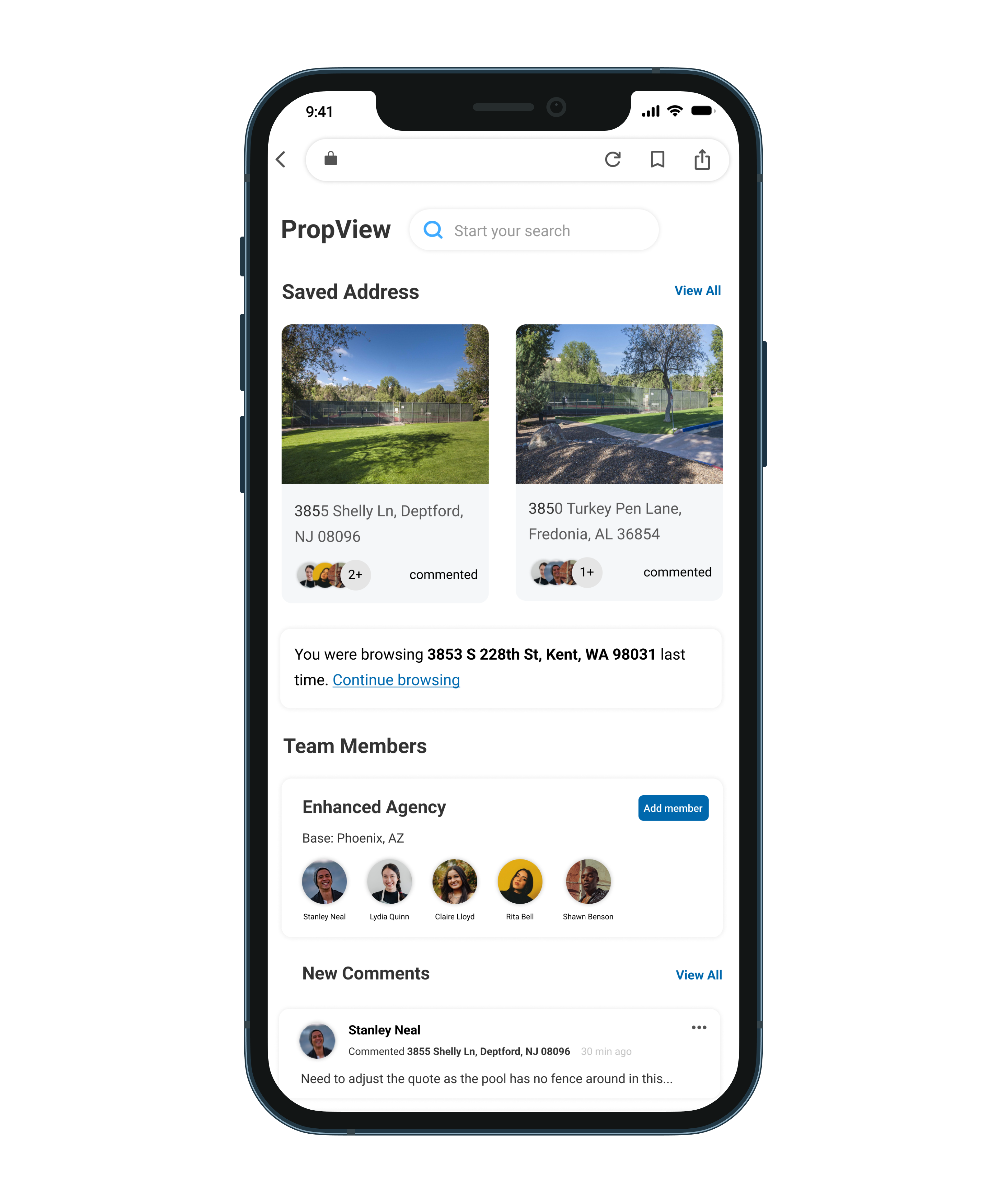
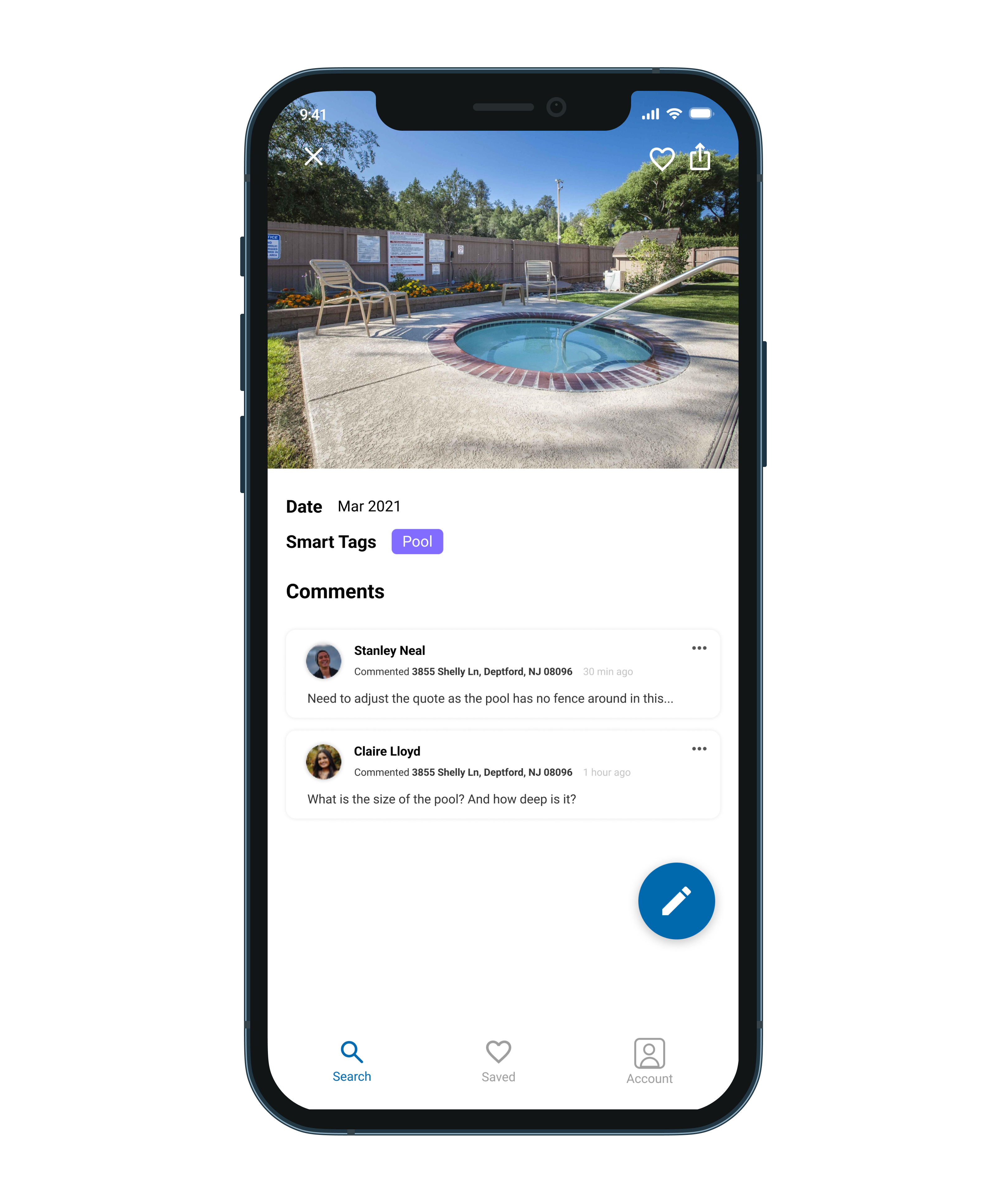
PropView
PropView is an internal website used by employees of American Family Insurance enterprise. It is a “one-stop-shop” for property photos, information, map view, and AI-enhanced predictions about the property or its attributes. Before I join, PropView was mainly used by Amfam underwriters. We wanted to expand the use case of PropView by creating customized experiences for the following user groups: Agents, Claims, Public, and Commercial Farm/Ranch. I focused on agents during my employment as they are important stakeholders of the company.
Problem
The RBC Interface Guideline (RIG) is RBC’s official design system. It provides reusable coded components, design patterns, global standards, and a shared tooling ecosystem that supports collaboration between designers and developers. RIG is actively maintained by a community of contributors and is documented across both Figma and the RBC.Design website.
Across the last few customer satisfaction surveys, documentation has consistently surfaced as an area needing improvement. Highlights of the problem include documentation living in different tools, with mismatching and outdated information. Additionally, Figma is not an accessible and inclusive tool for all of our users to access.
What is a design system
A design system is a systematic and scalable approach to product development. It provides set of components, tools, guidelines and workflows to create products consistently and efficiently.
In terms of daily work
Designers and developers no longer need to re-invent the wheel for simpler designs, and they can focus their energy and time on piecing the blocks together in new ways to solve problems.

Components
Different components have different sections documented on RBC.design website including interactive sample, API, usage guidelines, etc. The difference between what sections each component has as well as its naming are sometimes inconsistent. Components are also being documented with different templates, and the content under some tabs are sometimes missing.
Goal
My goal is to improve the documentation on our design system website so that users can trust that they will find what they’re looking for, and also helps to Increase in confidence and clarity delivered to our users. To achieve this, I need to make sure component documentation is consistent and up-to-date, and find out documentation strategies on RBC.Design website.
Approach
01
Persona
I began the process by creating personas and user flows to identify potential users of the interface guidelines. This helps me to identify potential stakeholders and gather their feedback on the current documentation.
02
Competitive Analysis
I then conducted a competitive analysis to examine the structure and strengths of modern design systems, identifying the common sections they include and determining which elements we could incorporate to improve our own.
03
Interview & Analysis
I conducted interviews with both developers and designers to gather insights on the current state of our documentation. Based on their feedback, I performed a SWOT analysis and developed recommendations for improving the documentation as well as enhancing the team’s communication with users.
04
Protoytpe
I created prototypes that incorporated these insights and carried out user-testing iterations to validate and refine the solutions.
Persona
Competitive Analysis
I researched different design systems on the market, including Microsoft Fluent, Google Material Design, Shopify Polaris, IBM Carbon, Airbnb DSL, Adobe Spectrum. Among the systems I reviewed, Spectrum and IBM Carbon stood out the most. Spectrum offers a Design Checklist that helps users easily identify missing component elements, while Carbon provides up-to-date news and articles that help users stay informed and better understand the system.
Interview
I conducted interviews with 12 participants—an equal mix of designers and developers who had significant experience using the RBC.Design website. The interviews focused on identifying which sections users found most helpful, what information they felt was missing, and what additional content could better support their workflow. I also provided a short survey that asked participants to rank different component sections based on their preferences. This helped me determine the relative importance and access frequency of each section, which later informed how I prioritized and reorganized the content.
Based on user feedback, the primary usability issues in our design system fall into three main areas.
.png)
User also provided feedback regarding to specific sections:
Usage Example
Users expressed a desire for more usage examples including variations that support different use cases and demonstrations of how components work within page-level layouts.
.png)
Accessibility
Visual designers expressed concern for accessibility, particularly in areas such as visual accessibility, adequate hit areas, and proper keyboard interactions.
.png)
Change log
Developers expressed the need for a dedicated change log, as it makes it easier to track updates across versions and supports onboarding for new team members.
.png)
Proposed Solution
Based on the interview feedback, I implemented several modifications to address the identified issues:
•First, I reordered the sections according to user preferences. For example, most users identified the interactive sample as the most helpful component because it provides hands-on engagement, so this section was moved to the top of the page.
•I also added more rationales and real page-level examples to give users a deeper understanding of how each component works and how it should be used in context.
•Regarding the page layout, I designed a new template that improves navigation by separating content into distinct sections: guidelines, component interface, accessibility, and decision log. This structure makes it easier for users to locate the information they need.
•Additionally, the updated template benefits both designers and developers by embedding direct links to the corresponding Figma, Storybook, and GitHub resources for each component.
.png)
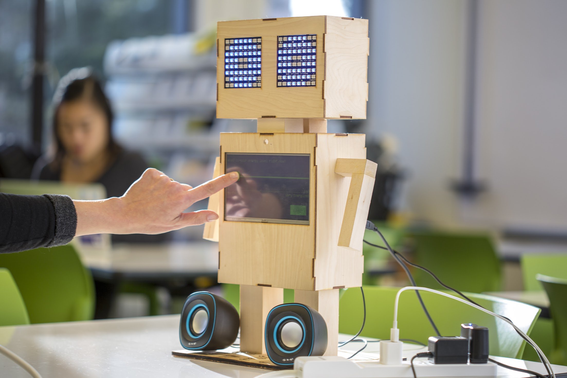
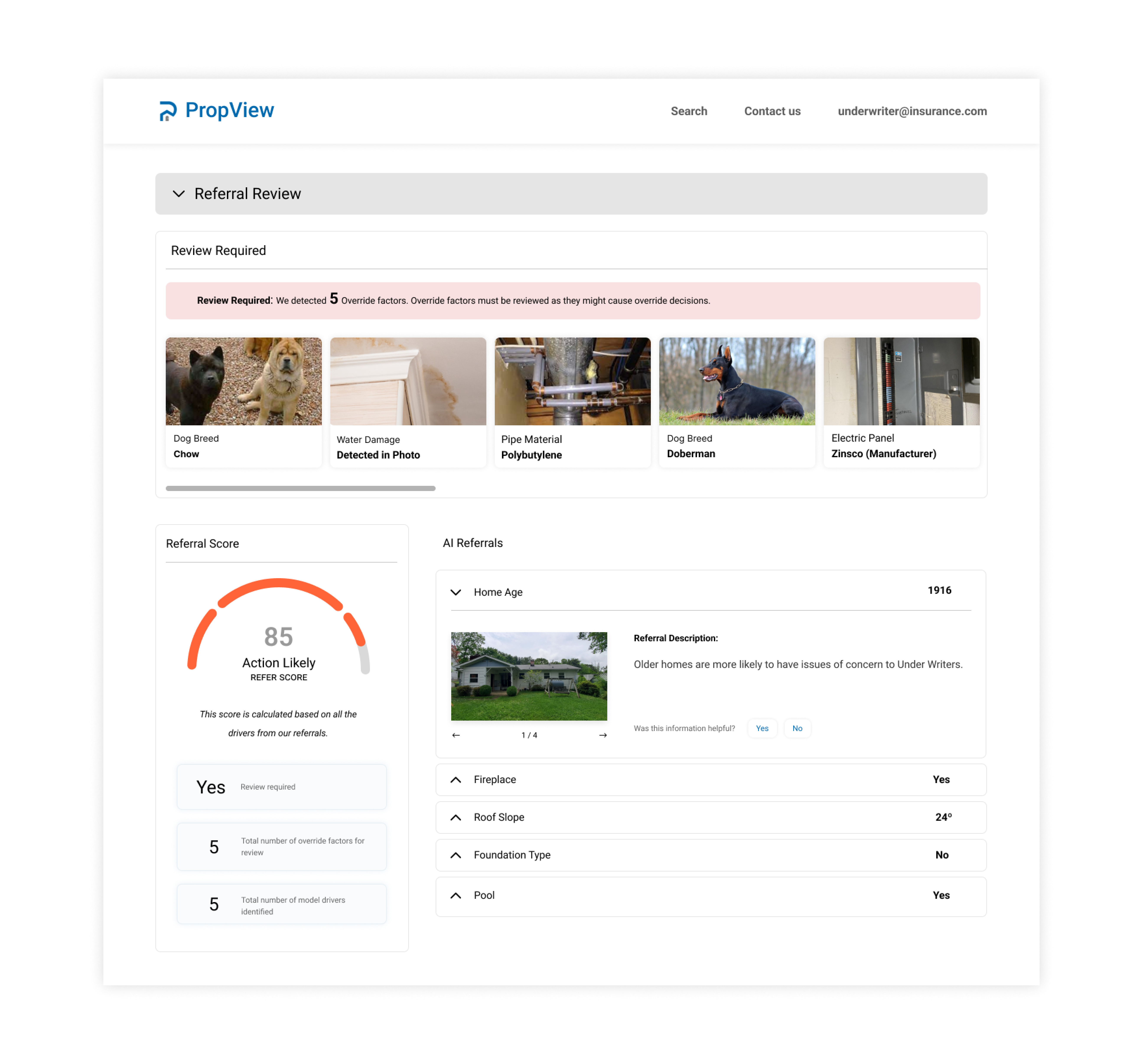
Canary
Canary is internal and employee-facing specifically built for Underwriters. The machine learning models evaluate for specific risks that the insurance company cares about. The primary use case for these models is to help Insurance underwriters speed up and better evaluate self-inspections completed by customers who have a new or renewal insurance policy.
To provide underwriters access to Canary, I need to incorporate result of those machine learning models into Propview. I worked on designing data visualization with regard to how we make the AI predictions more understandable to the user. I also worked on how we can measure the impact of AI models on underwriting decision making when they determine insurance coverage, and incorporate into my designs.
.png)
.png)
Interactive prototype
Below is an example of the interactive prototype for one design element—the checkbox component. We have applied this same approach to all design elements across the RBC.Design website to ensure consistent usability and a cohesive user experience.
Reflection
My work embodied the intersection of Machine Learning products and Human-Centered design, ensuring the tools we developed served both the users and the business needs effectively. I am glad that my role as a UX designer impacted the organization's AI-driven products as my work been deployed by software engineer in the team. Moreover,my solutions to these projects created impacts on the insurance processes at American Family Insurance.
In the future, I would also like to see my team bringing more state-of-art technologies such as mixed reality and augmented reality into home inspection tools that we've worked on, creating more success for stakeholders and the company. As I recognize the iterative nature of UX design and the importance of continuous learning and adaptation, I will carry this experience into my future career and create more user-centered and data-informed solutions.
During my internship, I had the opportunity to work closely with designers and developers to improve the usability, clarity, and structure of a large design system. Much of my work involved understanding how different users interacted with documentation, identifying gaps or pain points, and proposing solutions to create a more intuitive and consistent experience.
This experience helped me strengthen my skills in communication, collaboration, and problem-solving across cross-functional teams. I also gained a deeper appreciation for the importance of clear documentation and thoughtful information architecture in supporting both designers and developers.